

Product Manager
Harsh is a distinguished Cloud Expert with an extensive background in product management.

Maximize Your Cloud Efficiency: Introducing Hourly Dashboards in CloudKeeper Lens
It is essential for every organization to manage cloud costs in the long run to optimize the cloud investments made across many verticals within the organization. In order to assist you with more granular-level insights, we are excited to announce the launch of a powerful new feature in Lens, a cloud cost visibility platform i.e., the Hourly Dashboard.
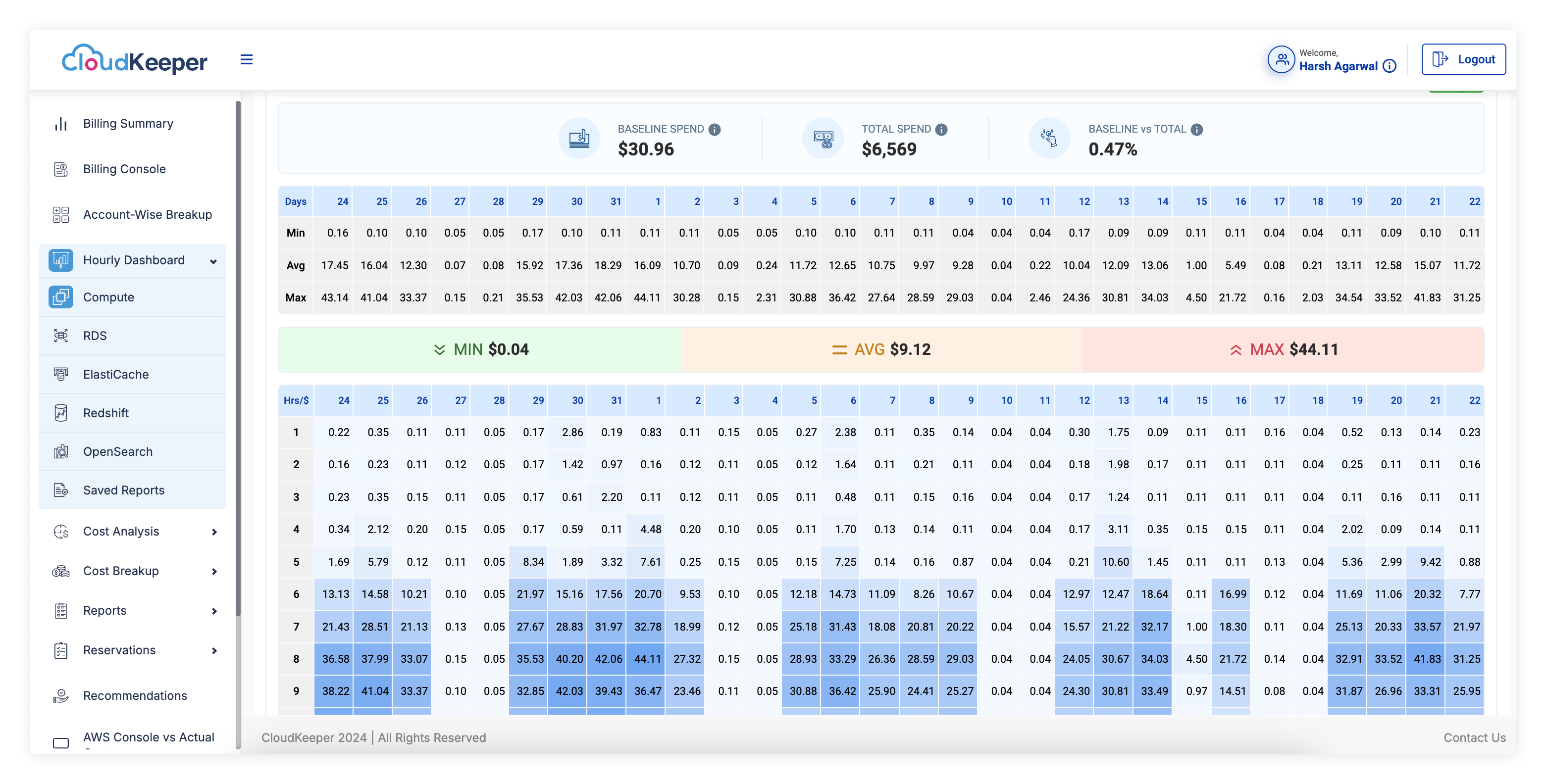
The main purpose of Hourly Dashboards is to provide an hour-by-hour view of the AWS spending, i.e., what is the cost incurred in each hour of the day? This helps ensure that we are able to track our AWS spending with better precision, which in turn gives us the ability to visualize how our expenses fluctuate over the course of the day. We have enabled our customers with such granular insights that actually help them to make rational and informed decisions as far as cloud cost optimization is concerned.
The dashboard provides the split of your AWS costs at the hour level, which enables you to identify the hours when the overall cost rises and hours when the overall cost goes down. It is very important for businesses to have this level of detailed view of their AWS spend so that they can take necessary action as per the dynamic nature of the industry.
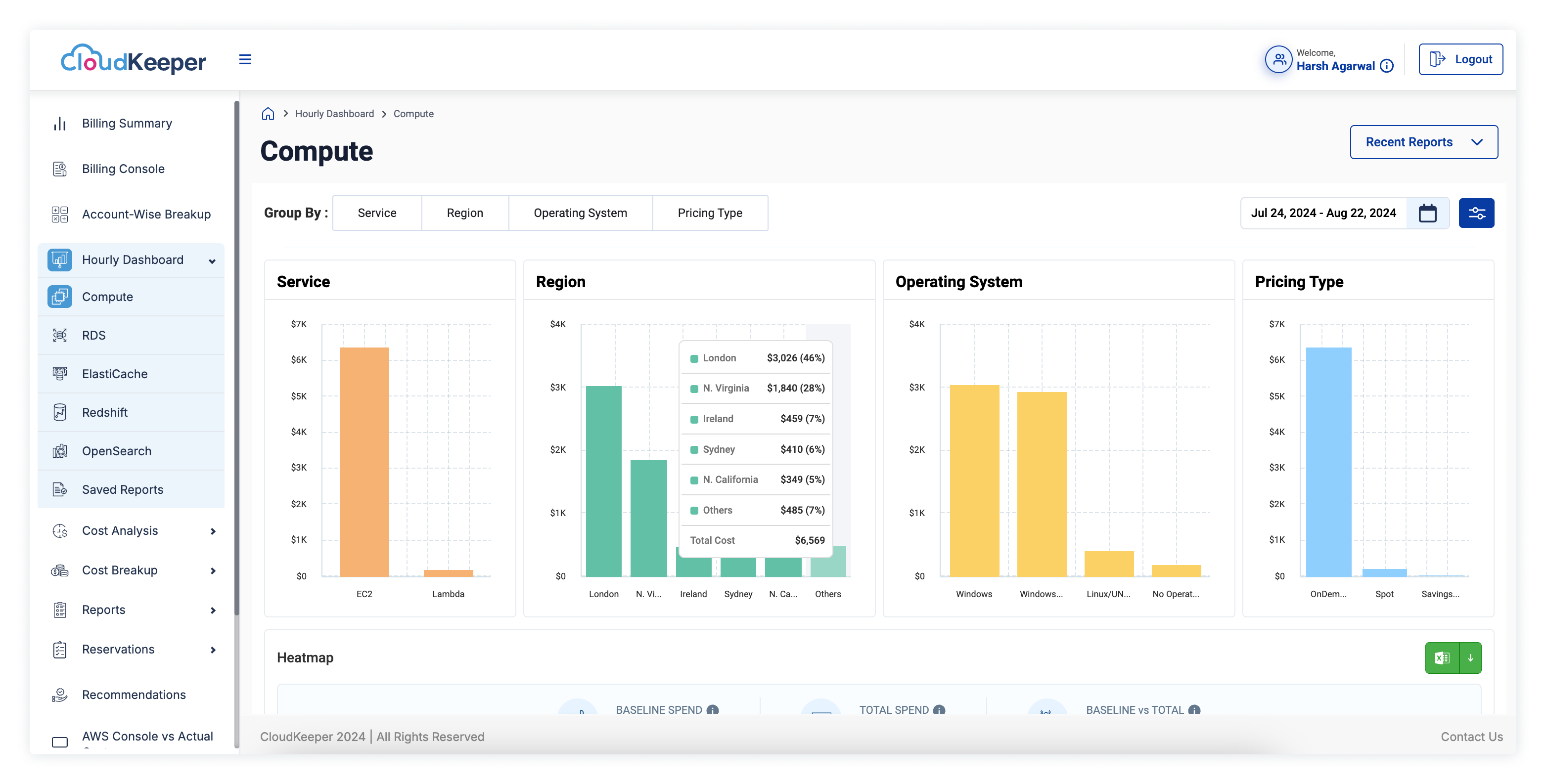
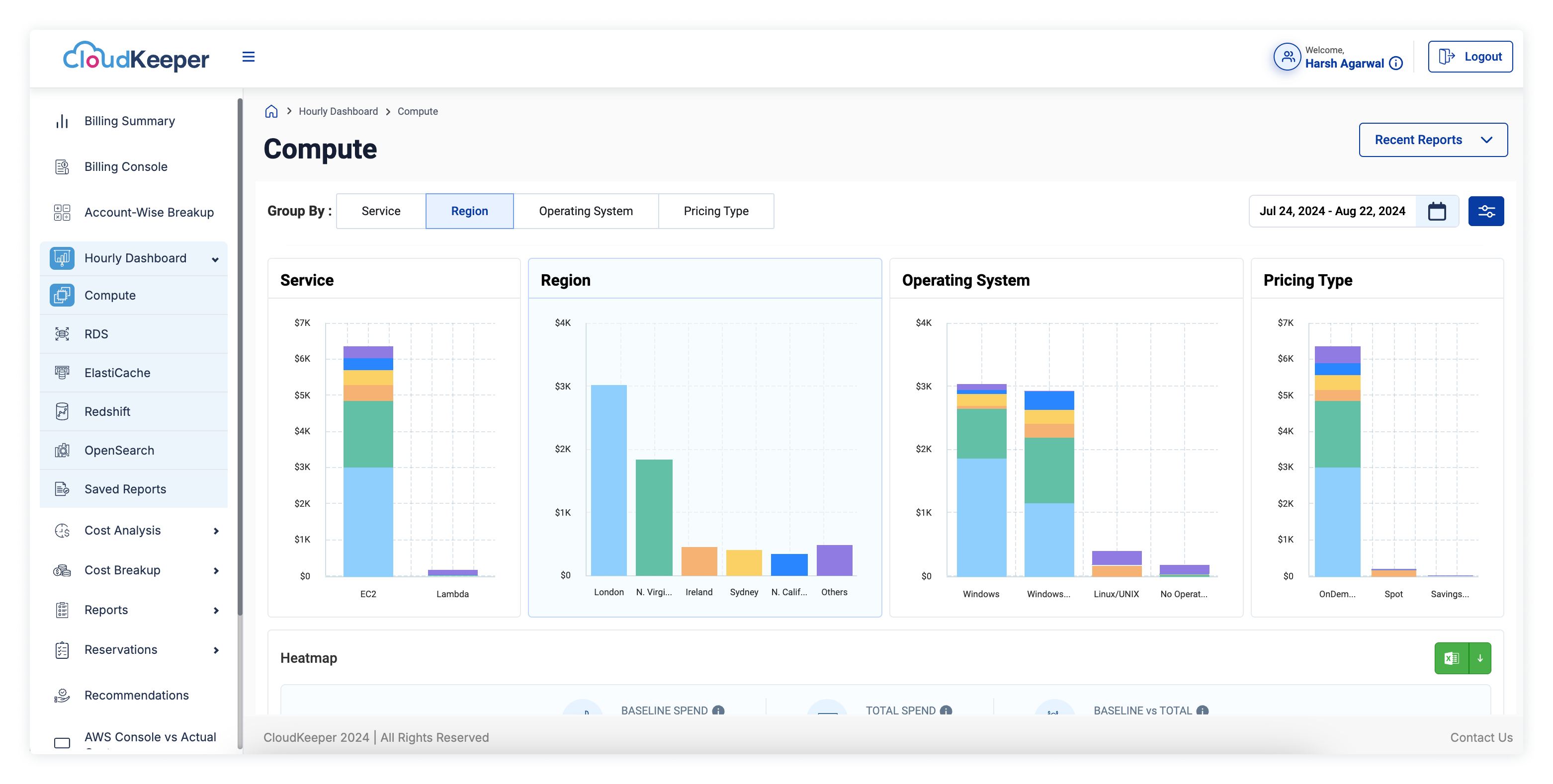
Service: This shows the amount of dollars getting spent on various services such as EC2, S3, RDS, etc.
Region: Clear understanding of how the AWS spend is distributed across various regions.
Pricing Type: Here, expenses can be tracked as per the pricing models available, such as On-Demand, Spot Instances and Reserved Instances.
Operating System: Track expenses as per the breakdown across various operating systems used in your instances.
Min, Max, and Average: To give you a holistic idea of the dips and peaks, hourly dashboards also provide users with minimum, maximum, and average costs for each day as per the selected date range. This enables users to identify patterns and get a good idea of variance in AWS spend.
One of the most important and unique features of the Hourly Dashboard is the heat map. This is a visual tool that makes the highest and lowest hourly costs more prominent, which makes it easier and quicker to detect the variance and cost anomalies pattern. Users are able to identify and make out the distribution of costs at a glance and, if needed, can dive deeper into the hourly cost data.
The Hourly Dashboard is an important functionality for customers aiming to gain clarity and transparency over their AWS spending. By facilitating a detailed breakdown of your cost at the hourly level, it assists you in making more informed and smarter decisions about how and when to utilize your AWS instances and overall cloud resources. This is how it can assist users:
CloudKeeper’s aim is to enable its customers with powerful functionalities and AWS cost monitoring tools that are required to have control and a close eye on AWS cloud spend; this enables them to save a lot of costs in the long run and unmask hidden cloud cost savings avenues.
We have added the below hourly dashboards that would help you better manage and keep track of your AWS cloud spending on a daily and hourly basis so that you can have good control over your overall expenditure:
Excited to start taking control of your AWS spend and optimize costs? Get onboarded on CloudKeeper Lens today and make use of Hourly Dashboards to begin your journey to improved cloud cost visibility & smarter cloud cost management.

99% of companies saved up to 15% monthly with this plan & achieved peak performance.

Speak with our advisors to learn how you can take control of your Cloud Cost


