Posted on:
Hourly Dashboard
The Hourly Dashboard has been introduced to deliver a more detailed, insightful, and visually engaging view of service-level spending across GCP. With dedicated service-specific dashboards for Compute, SQL, and Cloud Memorystore (Memcached, Valkey, and Redis), users can now analyze granular cost patterns across hours, days, regions, pricing units, and projects.
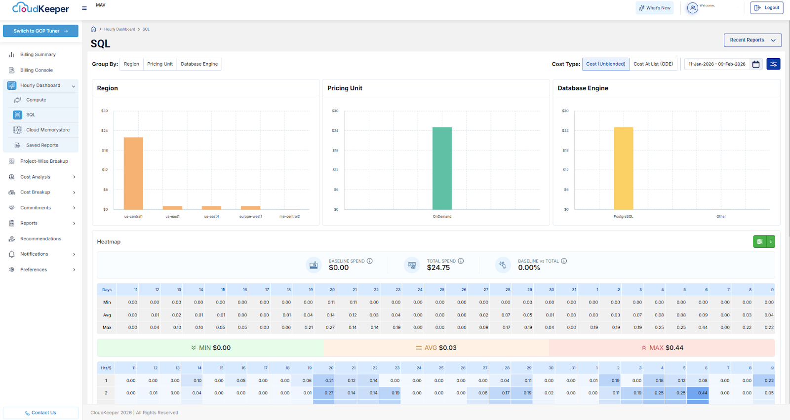
Each dashboard includes interactive bar charts, hourly and daily heatmaps, baseline vs. total spend metrics, and Excel export support, enabling FinOps teams, engineers, and cloud administrators to identify usage spikes quickly, spend anomalies, and optimization opportunities at an hourly level. The experience has been enhanced with refined filters tailored to each service type, ensuring cleaner and more relevant cost analysis.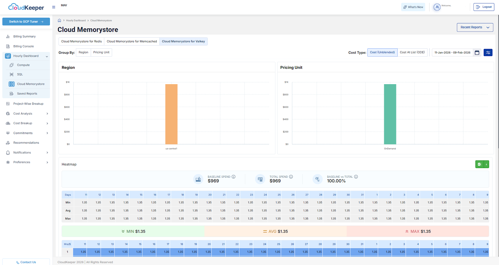
To simplify cost interpretation and align with GCP pricing models, the dashboard now focuses on two streamlined cost types: Cost (Unblended) and Cost At List (ODE). Service-specific filters such as machine type, database engine, pricing unit, region, project ID, resource, and labels allow users to drill down with precision.
Additionally, Memorystore dashboards include extended operational and billing fields such as Customer ID, Usage Hours, Pricing Type, and Usage Group, providing deeper visibility into cost drivers. Overall, this enhancement delivers stronger cost intelligence, improved anomaly detection through hourly heatmaps, noise-free service-focused dashboards, and faster, export-ready analysis for better cloud financial management.


